









With the heatwave surging on, it’s easy to put off autumnal shoot planning. After all, we feel a long way off the leaves dropping. But, alas, come the start of September autumnal campaigns will be in full swing, and it’s important to make sure your studio is equipped for whatever plans you might have.
Autumn is a season that gives photographers plenty to work with - warm tones, interesting earthy textures and a softer light allows for deeper colours to lend themselves naturally to portraits, product photography, fashion, food, and all forms of seasonal campaign.
And the great thing about Autumn? You don’t need to head outdoors and wait for the perfect pile of leaves, or a break in the rain, to capture the essence of the season in your shoots. Our range of studio backgrounds can do the legwork for you.
Colorama seamless background paper comes in an array of colours, from warm neutrals and earthy greens right the way through to richer reds and oranges – it’s easier now than ever to create a seasonal look while keeping a clean and consistent shoot.
So, onto the good stuff, which background colours work the best for autumn photography?
We’ve picked six Colorama shades that we are loving right now, and are well worth considering for your next seasonal shoot.
Ginger: the classic autumnal statement
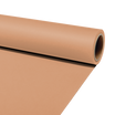
If you picture autumn as burnt leaves, terracotta tones and warm orange light, Colorama Ginger is probably the most obvious place to start. Its warm, earthy orange tone immediately gives a shoot an autumnal feel without needing lots of additional styling.

Ginger could work particularly well for:
- Autumn fashion and knitwear
- Portrait photography
- Seasonal product campaigns
- Food and drink photography
- Lifestyle content
For a softer look, you could pair Ginger with creams, beige, tan or natural wood tones. For something bolder, utilising darker browns, black or deep green can create more contrast.
It’s also a good option for brands wanting to create seasonal content that feels autumnal without relying on obvious (and perhaps cliché) props such as pumpkins or leaves.
Cardamon: warm, earthy and understated
For something a little more subtle, Colorama Cardamon brings warmth without dominating the image.
Its brown, earthy colouring makes it particularly versatile for lifestyle and product photography, where the background needs to contribute to the overall mood without distracting from the subject.
This could be a great backdrop for:
- Coffee and food photography
- Homeware
- Leather goods
- Skincare and beauty products
- Natural or handmade products
- Autumn lifestyle imagery
Cardamon also works nicely as an alternative to a traditional grey or beige background when you want a warmer finish.

Pair it with cream, black, muted green, gold or deeper brown tones for a simple autumn colour palette.
Copper: for richer, moodier autumn shoots
Autumn photography doesn’t always have to be light, golden and cosy.
For something richer, Colorama Copper offers a deeper colour that can work particularly well for fashion, beauty and more editorial-looking imagery.
Its muted red-brown appearance gives you a seasonal feel while still feeling sophisticated enough to use beyond autumn.

Copper could work particularly well for:
- Beauty and cosmetics
- Jewellery
- Fashion portraits
- Editorial photography
- Seasonal social campaigns
- Luxury product photography
It could also be a useful choice when shooting products with metallic details, black packaging or gold accents.
Keep the styling relatively simple and let the background provide the depth.
Barley: a softer autumn neutral
Not every autumn shoot needs a bold background.
Colorama Barley is a softer neutral option that can work well when you want the styling or subject to bring the autumnal colour instead.
Its warm beige tone gives you plenty of flexibility and can help create the cosy, understated look often associated with autumn lifestyle campaigns.

Barley could suit:
- Skincare and cosmetics
- Family or portrait photography
- Neutral fashion
- Product photography
- Lifestyle brands
- Handmade or natural products
It’s also particularly useful if you need one background to work across several different setups during the same shoot.
Bring in warmer colours through clothing, packaging, props or flowers, while keeping the backdrop clean and simple.
Fern: bring some autumn green into the studio
Orange and brown tend to get all the attention in autumn, but muted greens can be just as effective.
Colorama Fern offers a softer earthy green that can introduce colour without becoming too bright or summery.

It could work particularly well for:
- Botanical products
- Natural skincare
- Food photography
- Floristry
- Sustainable brands
- Earthy lifestyle imagery
Fern is also a useful option if you want to move away from the more predictable orange-and-brown autumn colour palette.
Try combining it with tan, cream, warm brown or muted yellow for a natural seasonal look.
Because it is less overtly autumnal, it also has the advantage of being useful throughout the year.
Damson: autumn with a richer colour palette
For a deeper and slightly more dramatic autumn look, Colorama Damson is an interesting alternative to the traditional warm neutrals.
Its plum-like tone can work especially well as autumn begins to move towards winter, giving shoots a richer, more luxurious feel.

Damson could be a strong choice for:
- Beauty campaigns
- Cosmetics
- Fashion
- Portrait photography
- Jewellery
- Seasonal gifting content
Pairing it with cream or beige can soften the overall look, while black, gold or deeper reds can make the image feel more dramatic.
It’s also a useful backdrop for businesses creating content that needs to transition naturally from autumn into the festive season.



Leave a comment
All comments are moderated before being published.
This site is protected by hCaptcha and the hCaptcha Privacy Policy and Terms of Service apply.